
What Battersea Power Station taught me about the value of satellite embeddings
Sometimes, magic finds its way through the forest of math that underpins most of my research. I spent a good amount of time a couple of weeks ago working on our embeddings workshop for GISRUK. We just released a new data product with Google satellite embeddings for small areas in the UK, and we couldn’t wait to take it on the road. This post is a note about one of the most insightful moments I had while preparing the materials but, if you want to check out the entire workshop, it’s all open at:
https://imago-sdruk.github.io/embeddings_workshop/jupyterlite/content/02-Change.html
One of the most appealing characteristics of satellite embeddings is their ability to explore change. Since embeddings map the information in an image to a shared latent space, it doesn’t matter where or when that image was taken, it all gets encoded in the same mathematical “language”. Exploring whether the location of an image is similar or not to that of a different image; or whether such location has changed compared to what it looked like at a different point in time, is relatively straightforward. You can play with the “comparison across space” idea in our Imago UK embedding Explorer. And we played with change across time in this notebook.
The part that got me is the last exercise. We ask the question what area has become the most like Hyde Park between 2020 and 2024? This seems a bit esoteric but, I think, is an interesting one to ask. We know areas change within a city all the time, wouldn’t it be cool to know which ones are becoming more like some specific landmarks? In the workshop, I called it “Hyde Park-ification”, but I may deny this in public… It also turns out this is relatively straightforward to check with embeddings. You can follow all the details, code included, in the notebook. The gist is you calculate how similar all areas are to Hyde Park in both years, take the difference of that distance, and pick your winner as the smallest of those.
Here’s our winner1:
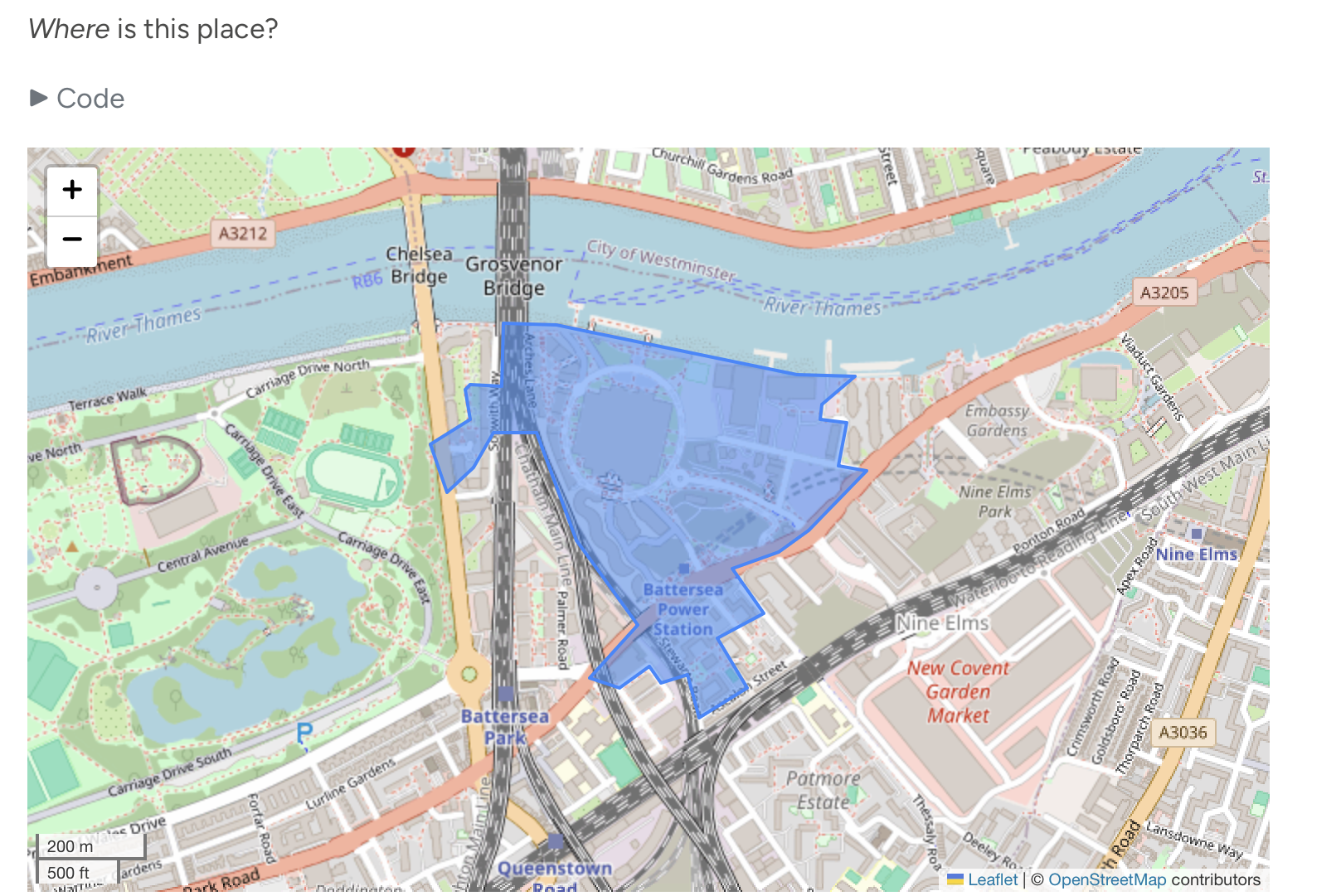
For the uninitiated reader, this is Battersea Power Station. Which, even if all you know is the first photo in the Wikipedia page I just linked to, you’d be forgiven to think this embeddings sorcery is nonsense. This is as far as you can get from Hyde Park in terms of look and feel. So, where’s the catch?
The catch, of course, is that we are not looking into overall similarity, but change. Our approach looks for areas that, over the period we consider, have become more like Hyde Park. That does not mean they are like Hyde Park. There’s another interesting bit we show in the notebook: Battersea Station, by the standards of the areas we use, has changed very little. Again, this is counterintuitive maybe, but not incompatible with what we’re asking of embeddings in this exercise: you can change very little, but entirely in one particular direction.
As it turns out, this is what happened to our winner. This insight did not come painlessly to me, as I struggled through a good 20/30 minutes of scratching my head about whether I was asking too much of this technology (particularly when it’s aggregated from the pixel to an irregular area). I’m glad I stuck with this and followed it to the bottom. And I’m glad Google keeps funding Google Earth for free, including its time travel feature. Below is a comparison of the area in question between 2020 and 20242:
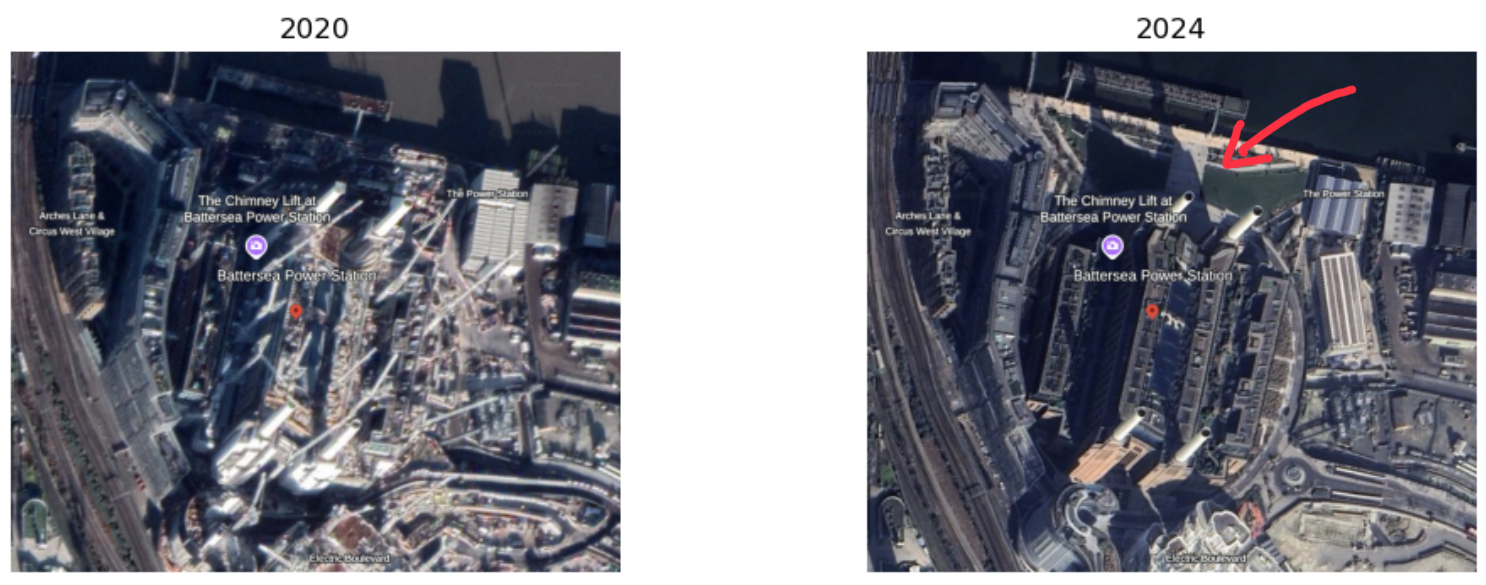
If you can’t spot the difference (I couldn’t for the first ten minutes), follow the red arrow (which wasn’t there when I was looking for twenty minutes). The area, broadly speaking, has not changed much (which checks out with our low score of change). It was, and still is, a retired power station turned epicenter of cool south of the river. Mostly chimneys, mostly concrete. But there’s a small part that has changed. A small patch by the river used to be concrete buildings but, in between 2020 and 2024, it was flattened. Instead, it is now a patch of grass where Londoners enjoy the three days a year where the sun shines with all its fury3. You can see some of the before and after photos in this article by the BBC.
I love this example because it captures very well why I’m so excited about embeddings and about making them accessible to more people through data products like our small area one. I knocked out that notebook in about an hour (if you exclude my Google Earth rabbit hole). In that period, I was able to leverage data from seven massive satellite sources (see Figure S2 in this paper for details), across two periods of time on a setup that runs on my iPad’s browser. Just let that sink in. What questions can we tackle that we couldn’t before? More importantly, which ones will we actually consider now that the price of asking is so low? I think we’re about to find out, and I can’t wait.